Top Ten
-
![]()
Top Ten Manicure
Branding for one of my personal projects - as a recently qualified nail tech! Top Ten references the manicure on your 10 fingers, with a nod to to music and the top charts. The branding was inspired by the designs of the printed newspaper billboard charts of the 60s and 70s, and for the colour palette I took inspiration from more printed material - the colourful makeup pages of teen magazine ‘Jackie’ from the same era. For the font, I used the same as I use for my Graphic Design portfolio to keep a visual thread going through all of my creative projects.
-
![]()
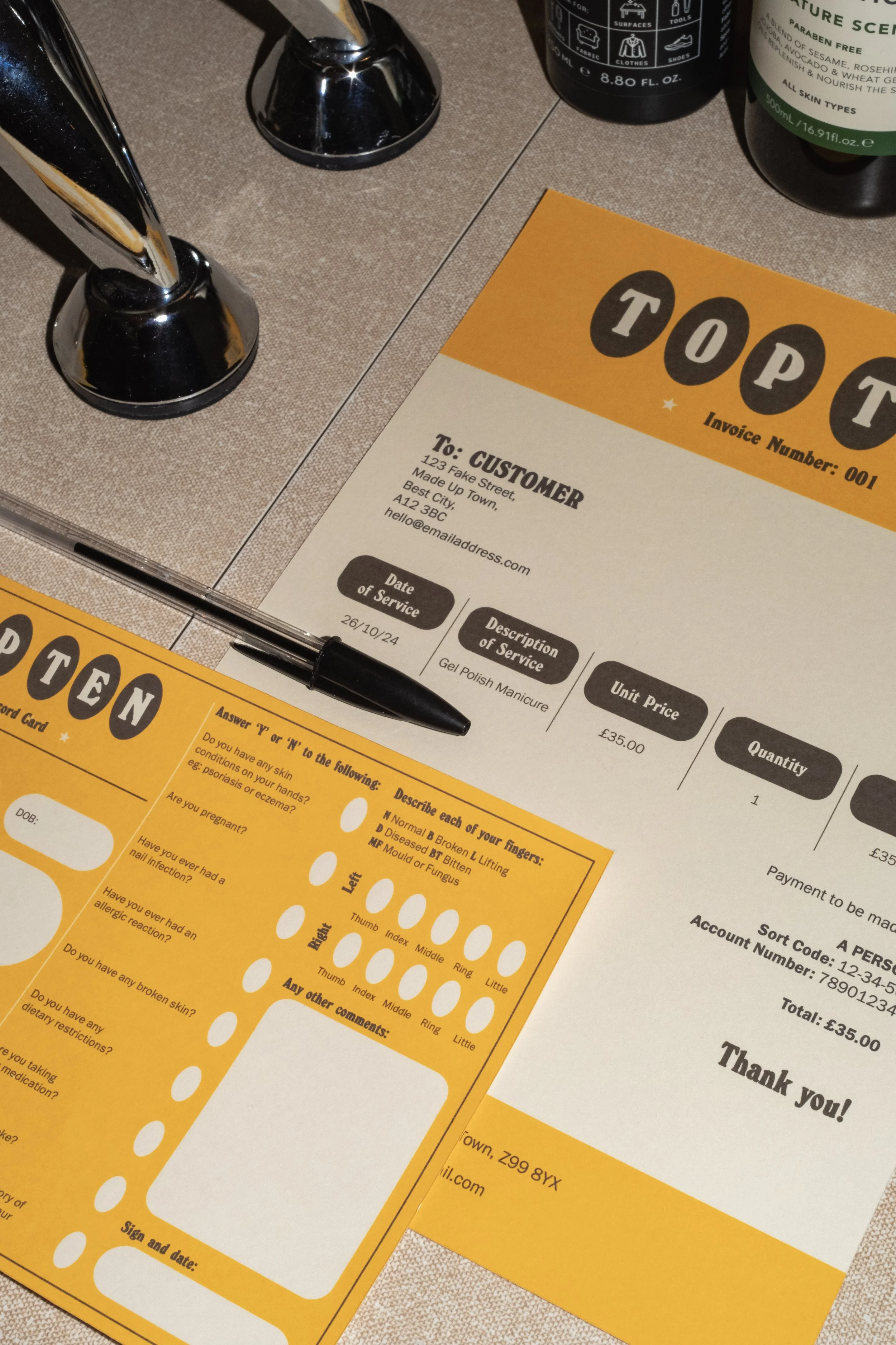
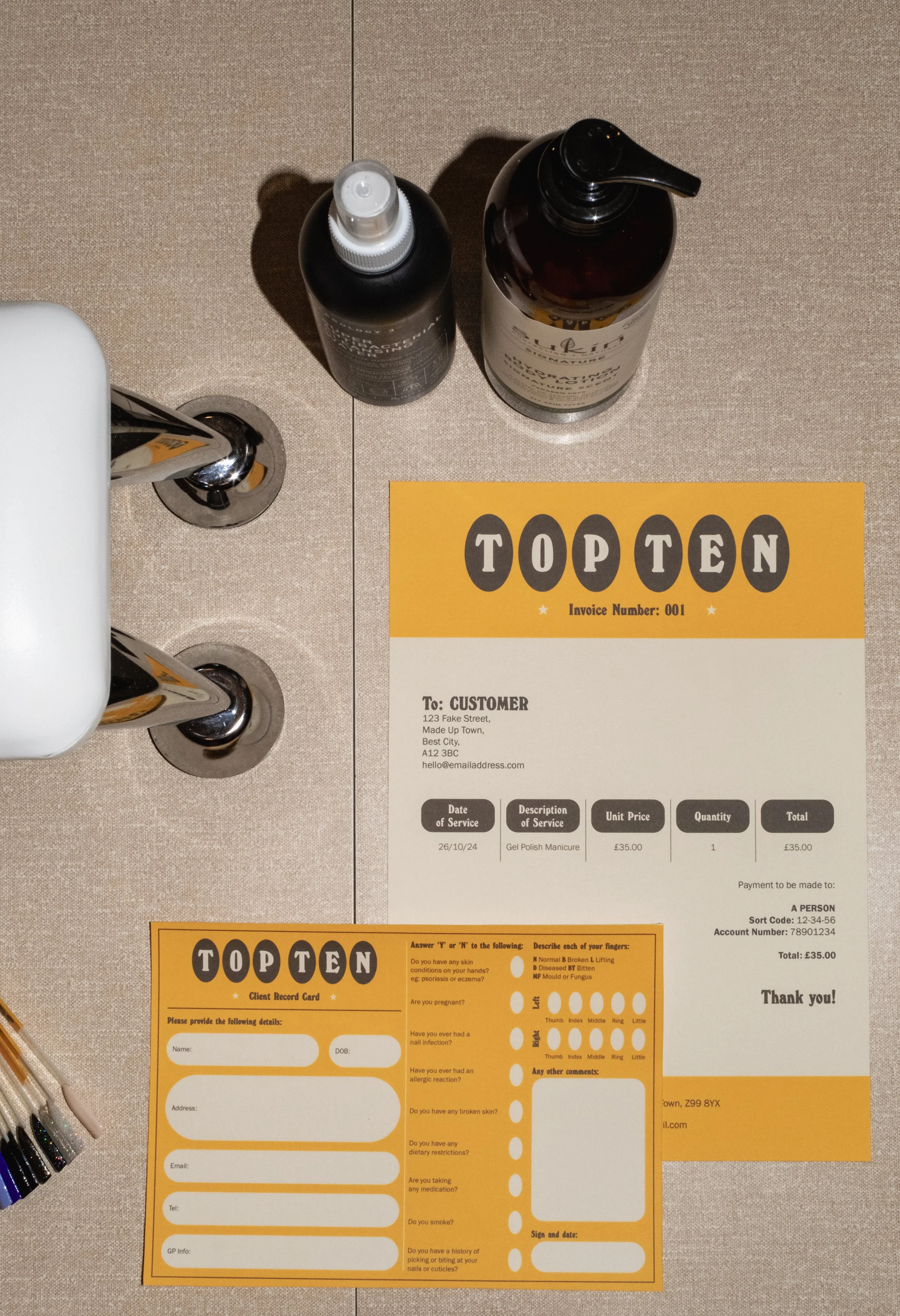
Invoice and Client Record Card
All clients must fill out a consultation form before their appointment.
-
![]()
Invoice and Client Record Card
Customer paperwork.
-
![]()
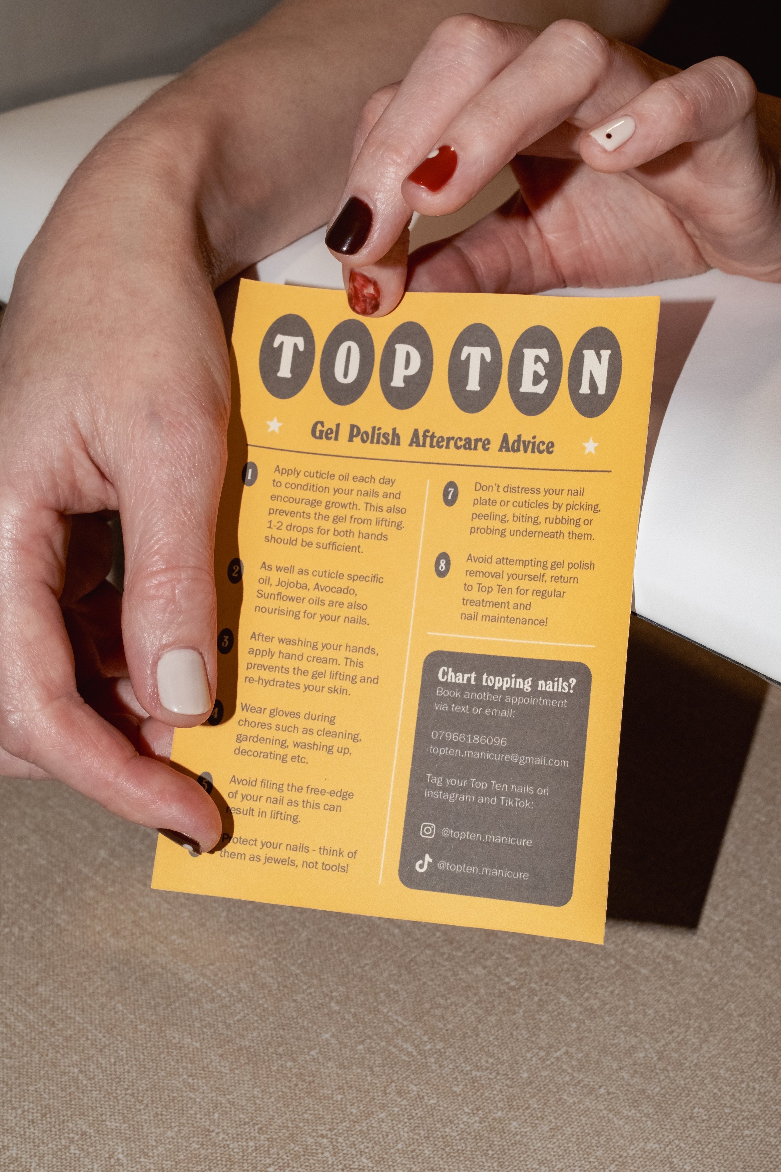
Customer Care Card
To be given to the client after their appointment.
-
![]()
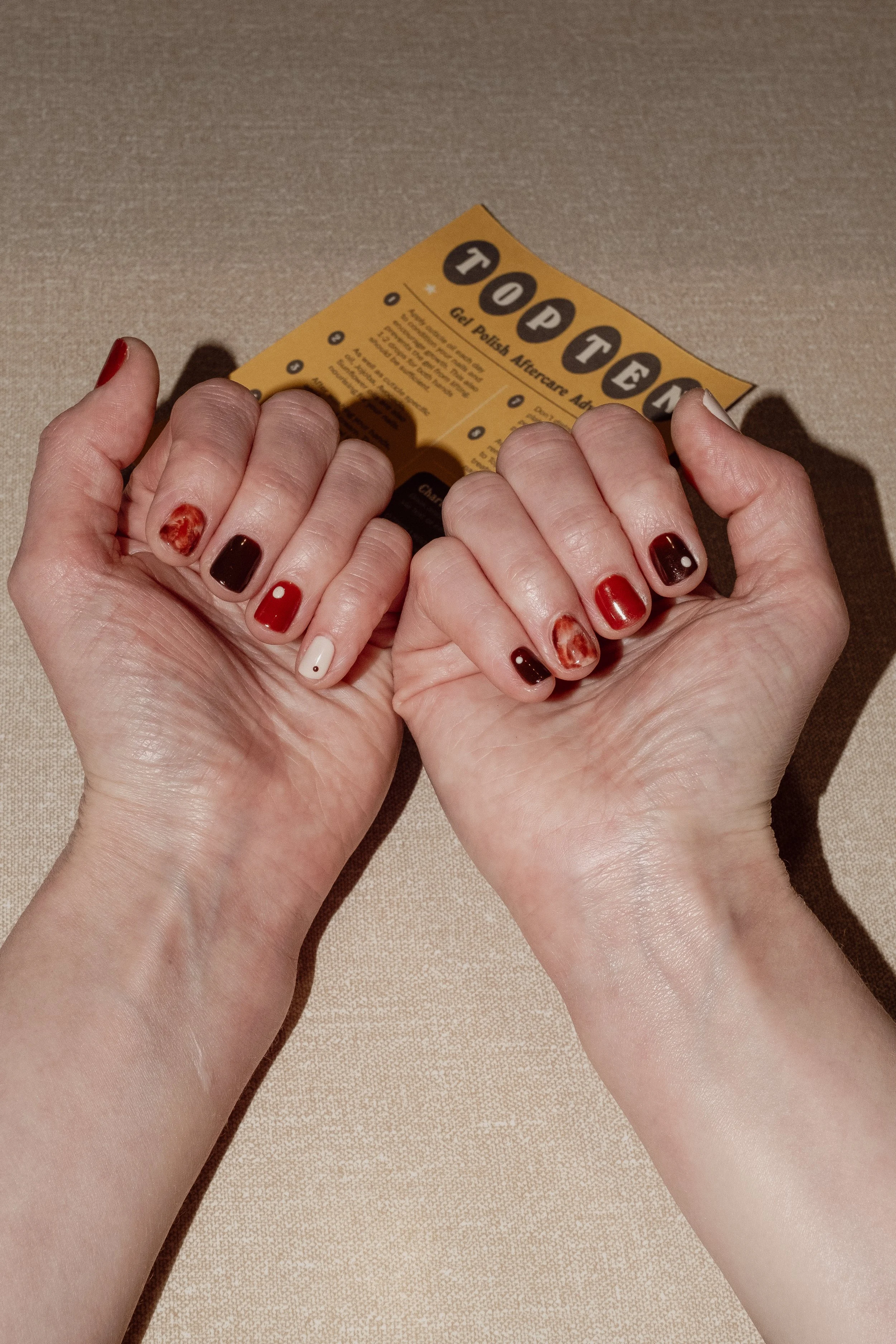
Happy customer!
A successful Gel Manicure.
On Tour ‘74
-
![]()
Collection Mood Board
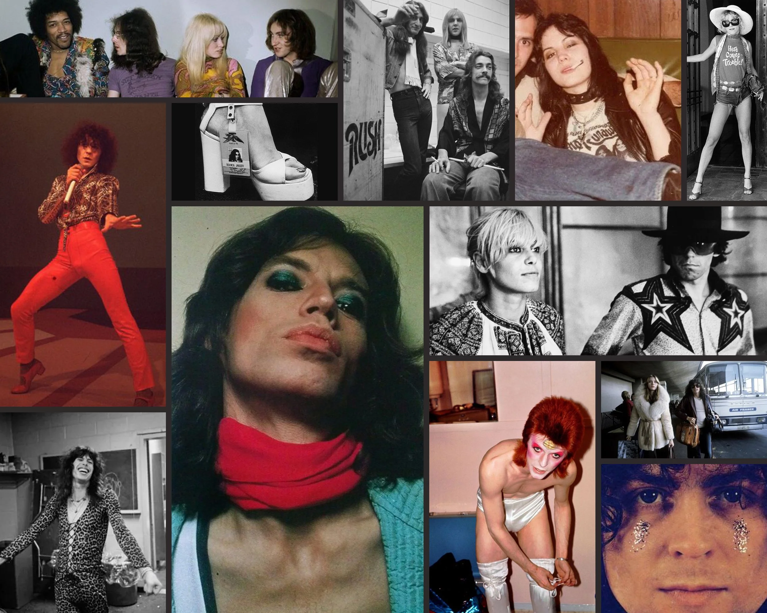
For The Hippie Shake’s AW23 Collection, we encouraged the customer to experience the expression and connection shared through live music, and go ‘On Tour ‘74’.
-
![]()
Campaign Shoot
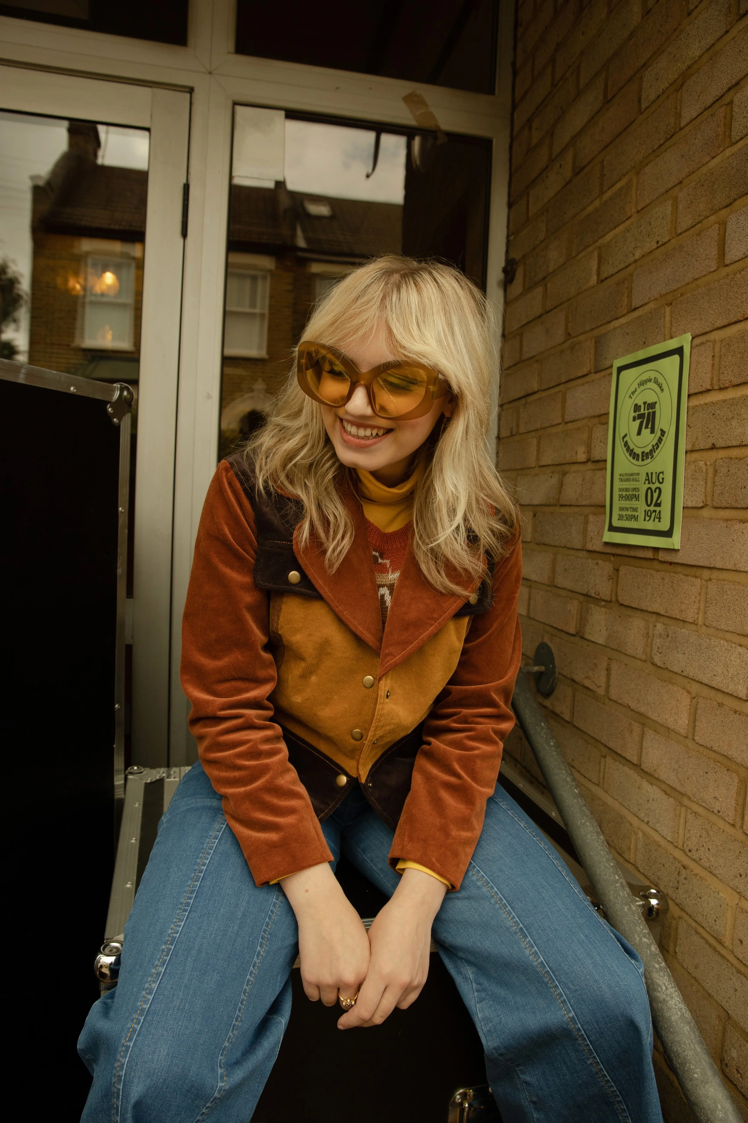
To represent this collection visually through photo and film, we followed the day in the life of band Picture Parlour as they prepare for a show. From load in to soundcheck, snacks and wardrobe in the green room to that first step on stage, we produced and documented the entire process - culminating in a real show to a real audience. To see more images, please see my Art Direction page.
-
![]()
Shoot Signage
To make ensure authenticity to both the guests and the customer, I made sure to replace any modern posters with branded ones which nodded to the era. A lot of these were taken home by gig attendees at the end!
-
![]()
Shoot Crew T-Shirts
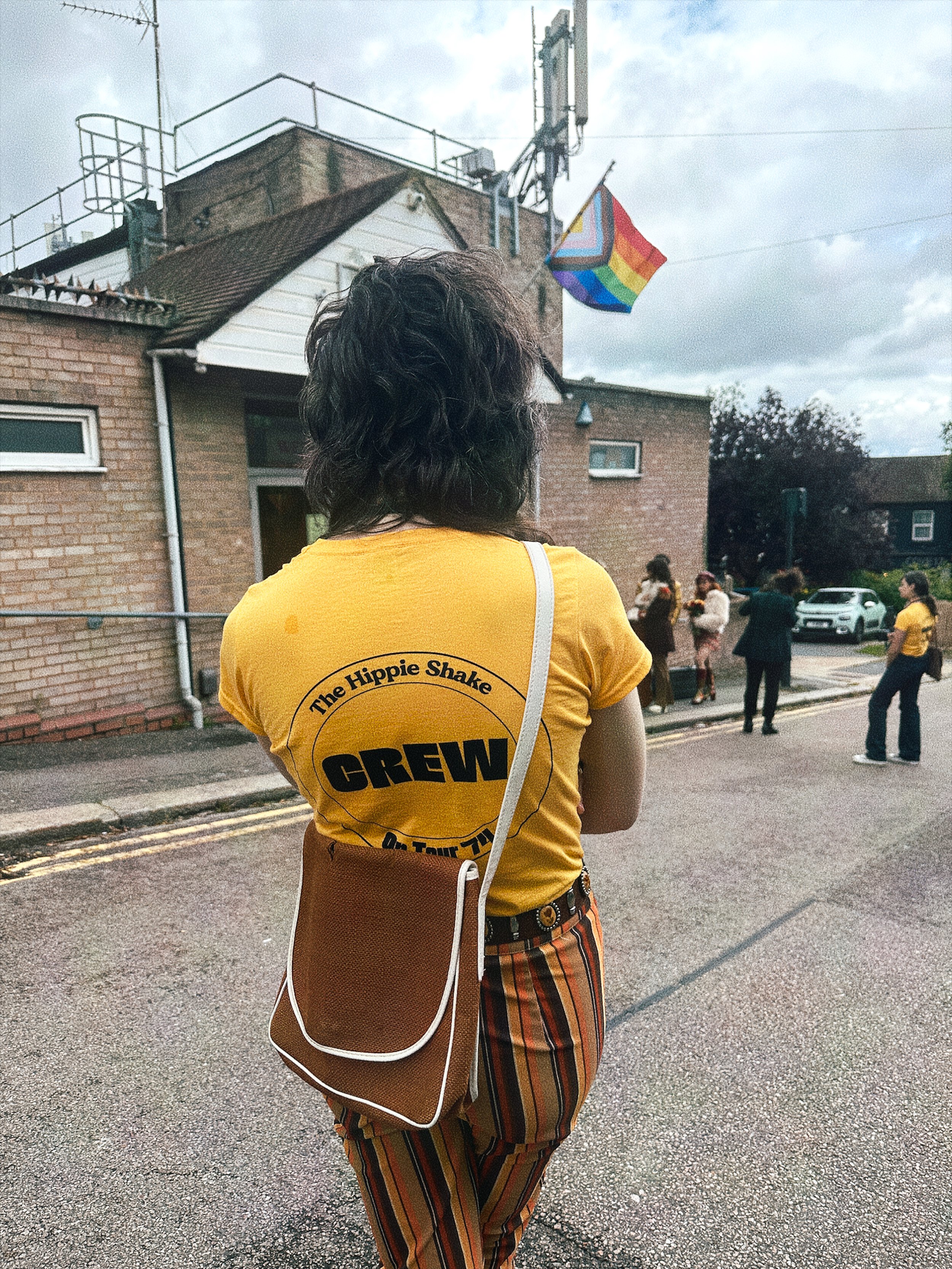
As we had asked the event guests to come dressed authentically for the time, we needed to make sure our crew stood out so they didn’t think we were breaking the dress code! I made these t-shirts with the collection branding so we would stand out easily to any guests.
-
![]()
Customer Thank You Card
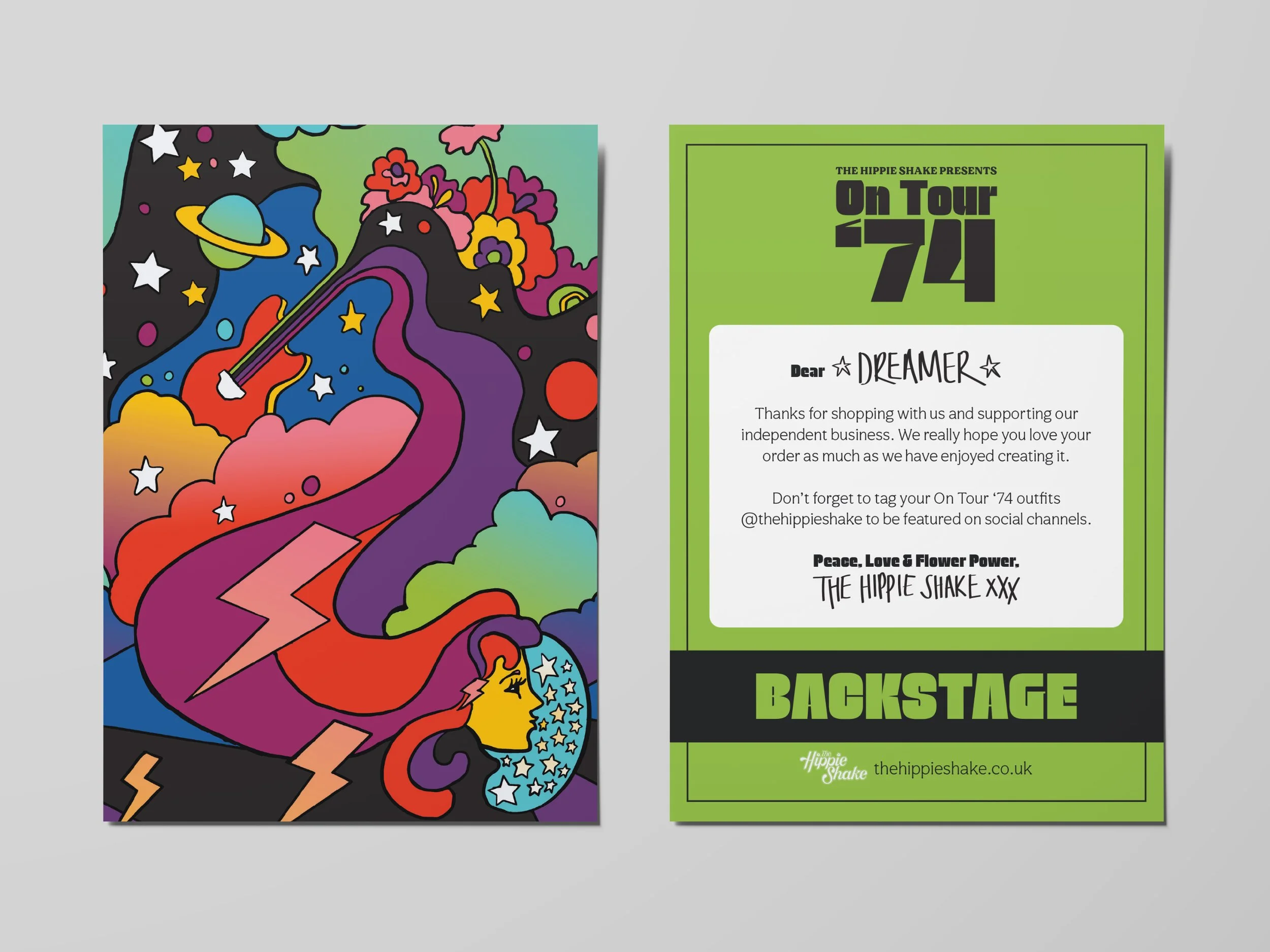
For each collection, artist and print designer Erin Cadigan designs a custom postcard illustration based on her prints created for the garments. On the back, I made the design look like a backstage pass and used my own handwriting for the names on the back to make it look like someone had written it with a marker - as they would on their AAA pass!
-
![]()
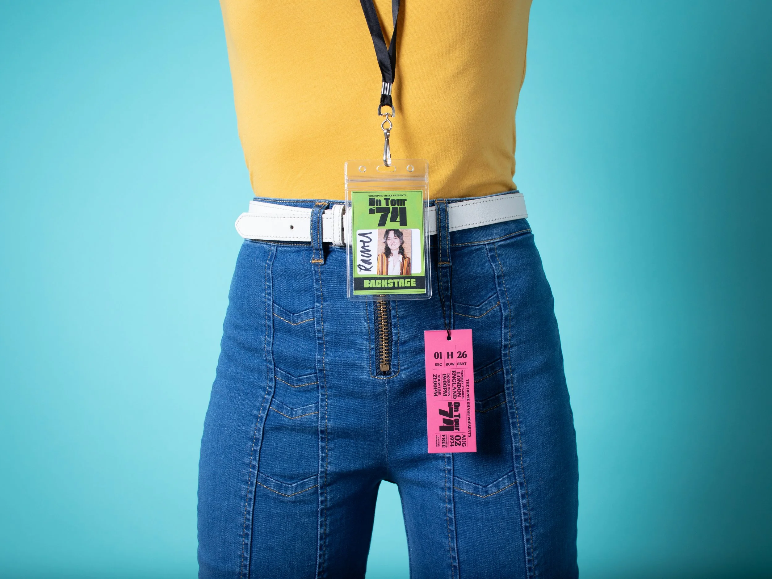
Swing Tag / AAA Pass
I had chosen a font to represent this collection and created a bespoke lockup, which I added to the front of the swing tag. I laid the type out to look like it was a vintage gig ticket, which matched with our AAA passes I made for the band and crew in the campaign shoot.
Across the Universe
-
![]()
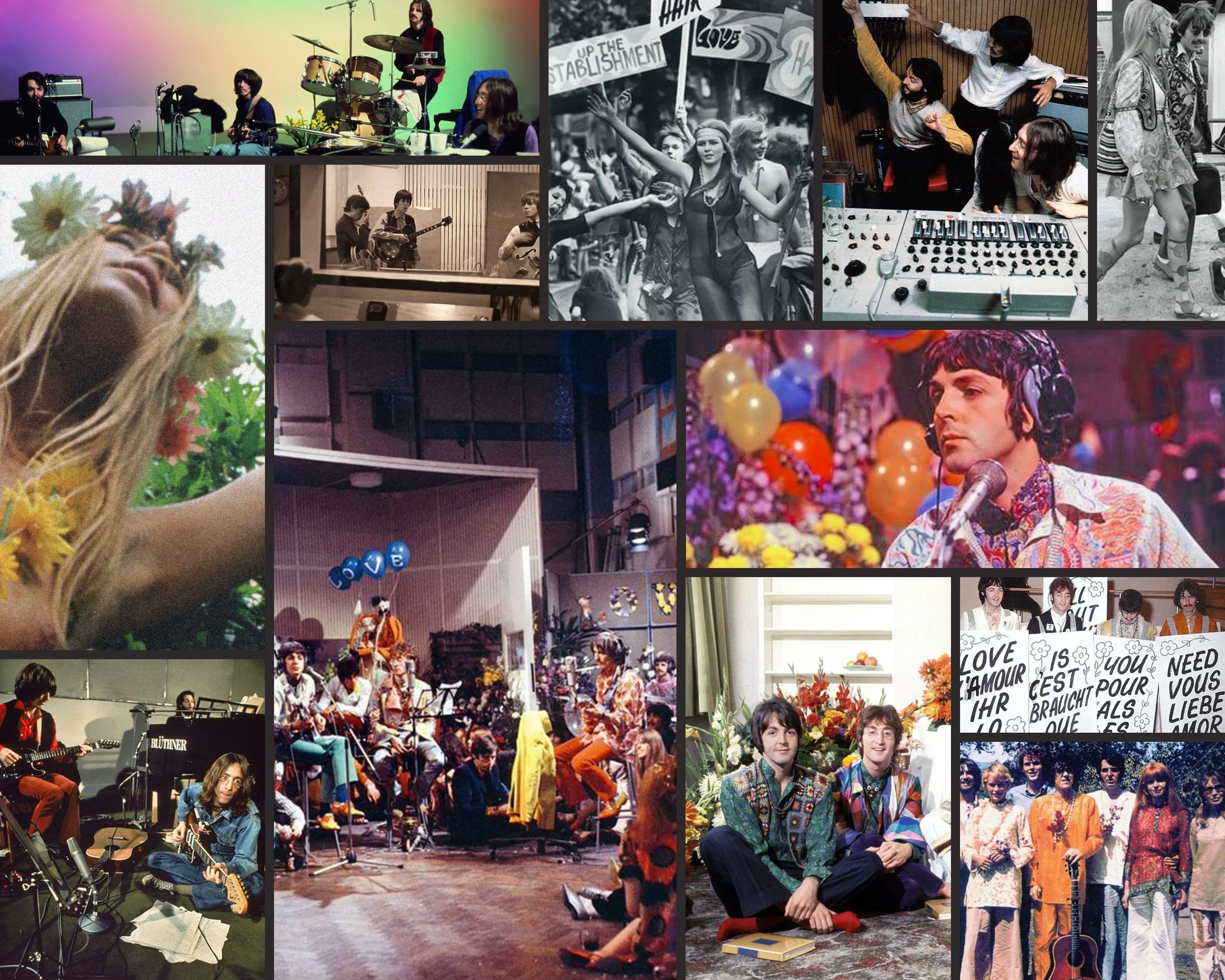
Collection Mood Board
Inspired by the experimental hedonism of the Summer of Love, and the craftsmanship and creativity of artists from around the world, The Hippie Shake’s Spring / Summer ‘23 collection was a spectrum of colours, statement vintage prints and out of this world embroidery. Bathing in the nostalgia of 1967 to create a treasure trove of gems inspired from all over the world with The Beatles, Pink Floyd & Haight-Ashbury with at the forefront of our inspiration.
-
![]()
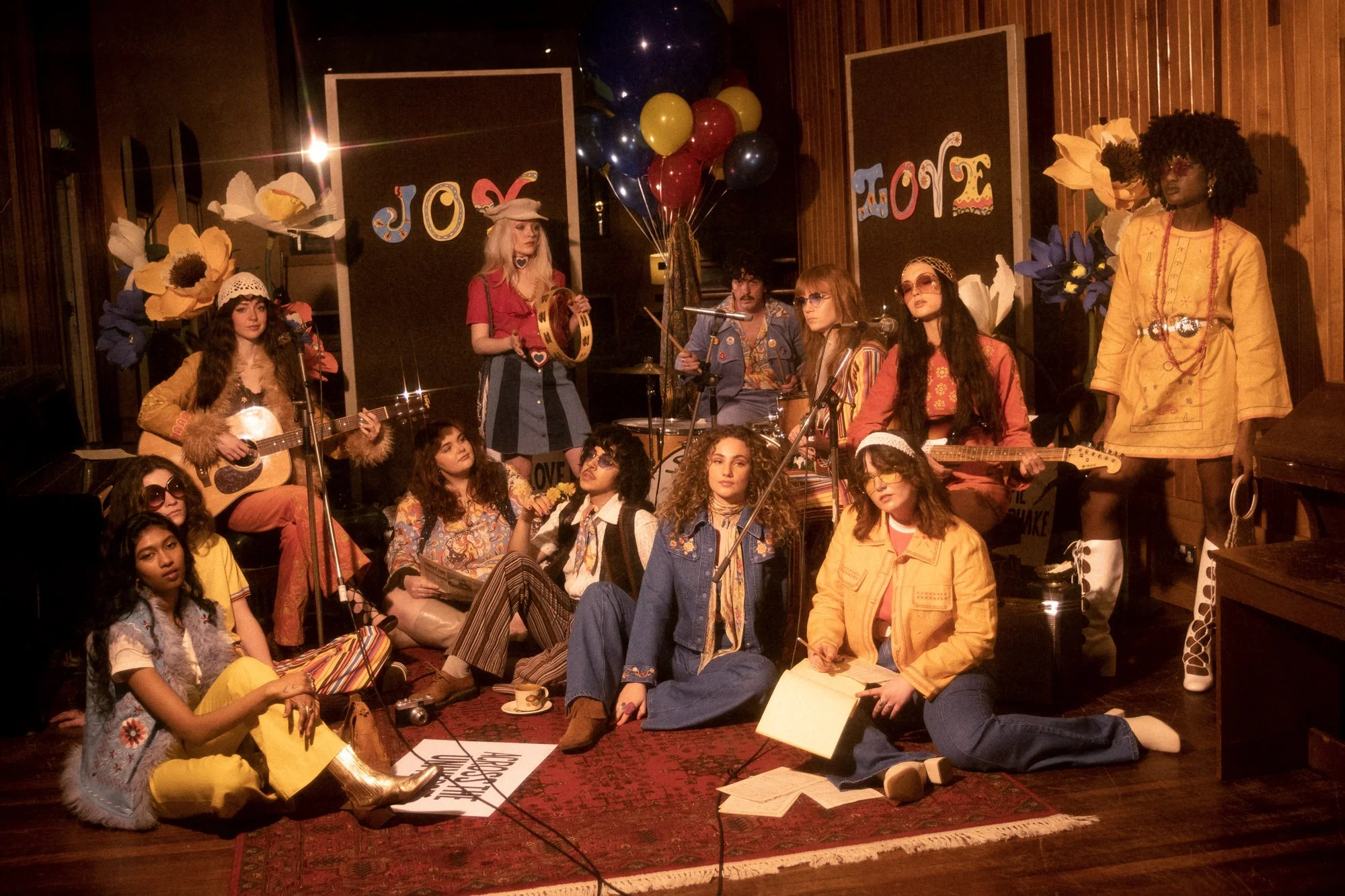
Campaign Shoot
For this campaign, I was heavily influenced by the ‘All You Need Is Love’ and ‘Get Back’ sessions by The Beatles and chose to reference these in our campaign and studio shoots. To see more images, please see my Art Direction page.
-
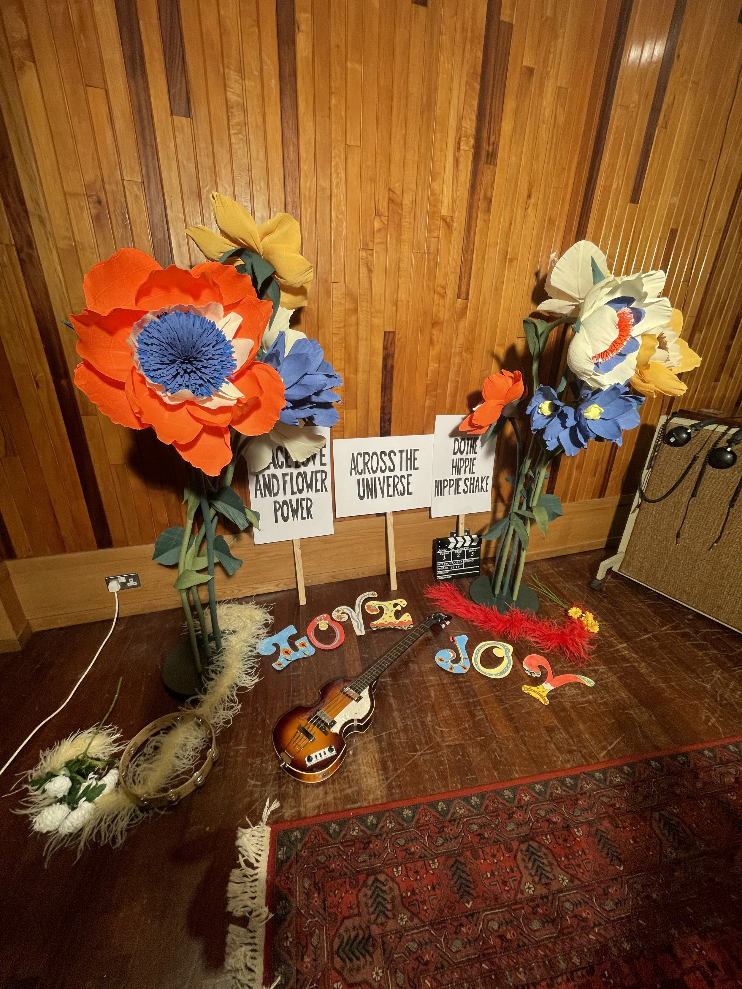
Photoshoot Hand Lettering
From personally hand painting signs and lettering to making sure all musical equipment was period correct, I focused on each and every detail to ensure authenticity always shines through everything I do.
-
![]()
Customer Thank You Card
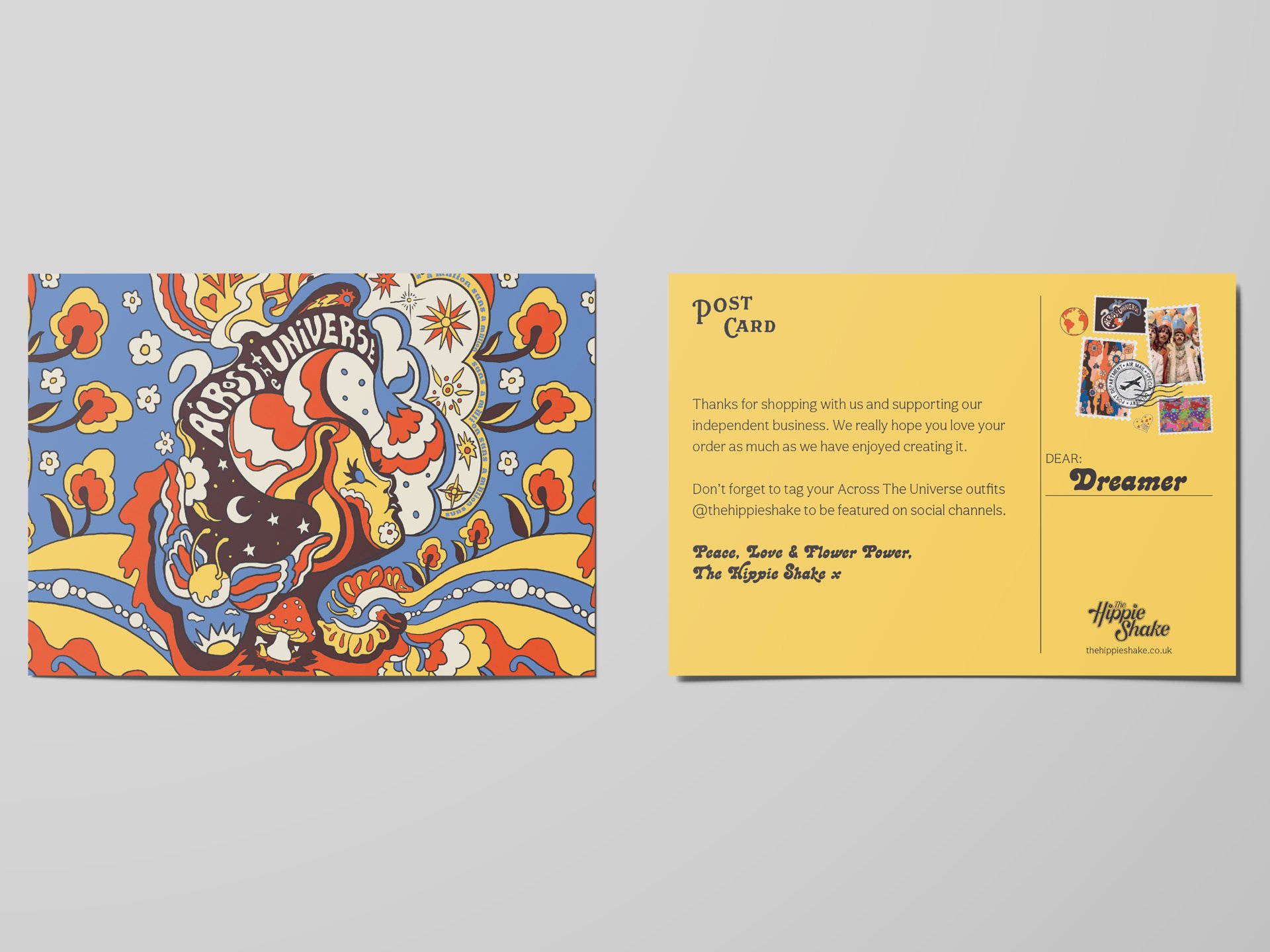
For each collection, artist and print designer Erin Cadigan designs a custom postcard illustration based on her prints created for the garments. On the back, I made stamps with the Beatles faces and a thank you note for the customer.
-
![]()
Garment Swing Tag
I had chosen a font to represent this collection and created a bespoke lockup, which I added to the front of the swing tag. I also briefed Erin Cadigan on a bespoke illustration for the swing tags. Frequent customers of the brand will often keep both the postcard and swing tag together as mementos of each collection, which are limited.
-
![]()
Collection Launch Party
To celebrate the launch of the collection, we invited customers and collaborators to join us for a gig and presentation of the garments. We dressed the venue with items from the shoots and images of the campaign.
-
Launch Party Signage
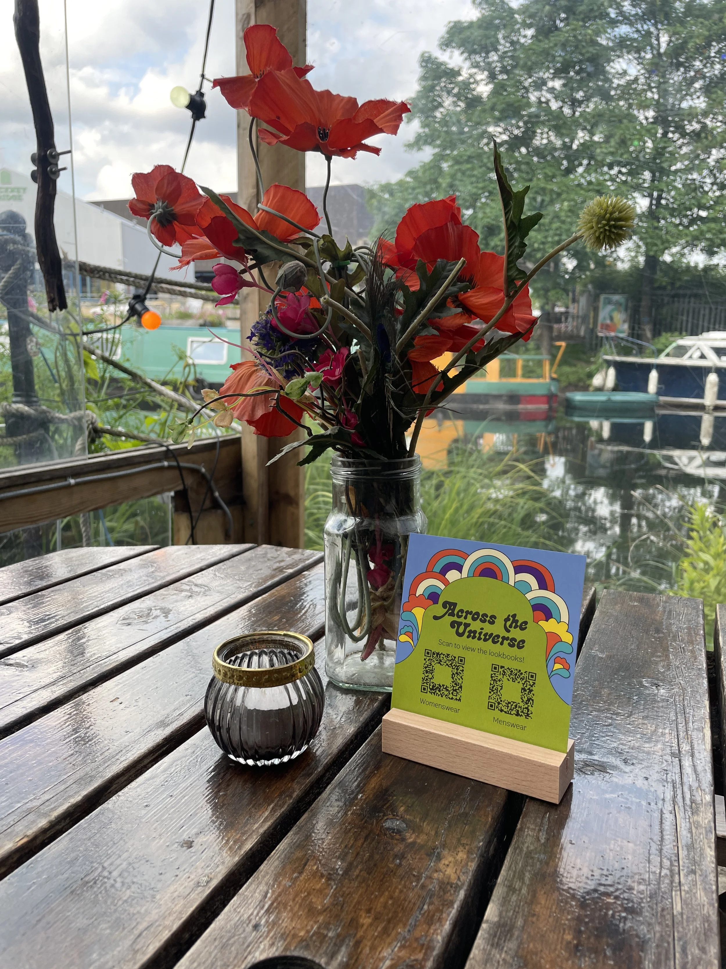
I created a digital lookbook for the guests to view on their phones while at the event. To let them know about this, I made little postcards with QR codes and dotted them about the venue.
Rising of the Moon
-
![]()
Collection Mood Board
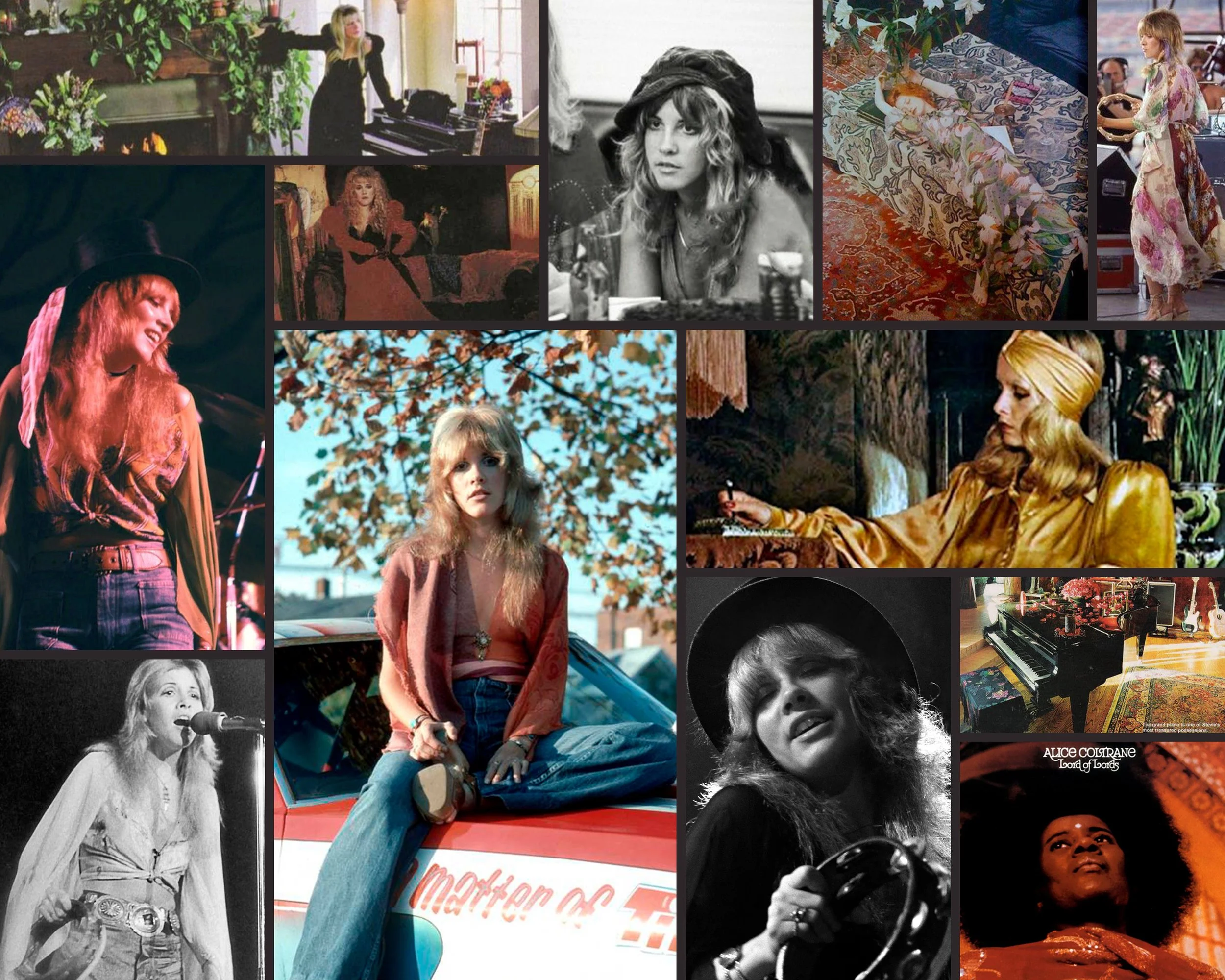
For Spring / Summer ‘22, The Hippie Shake took inspiration from the ethereal world of Stevie Nicks. From magical black and white textures and fabrics, to retro 70s shapes and prints, this collection was a versatile one, meaning it was important to have a campaign and shoot location that reflected this.
-
![]()
Campaign Shoot
We flew to Park-Hotel1970 in Michelstadt, Germany to experience a setting which was a complete time capsule, every room unique and the perfect setting to display every unique item from the collection. To see more images, please see my Art Direction page.
-
![]()
Customer Thank You Card
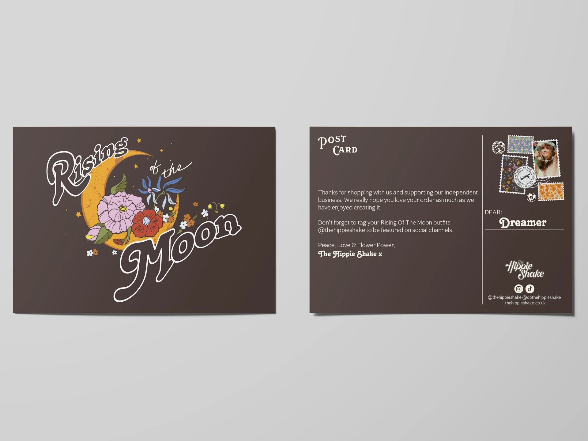
For each collection, artist and print designer Erin Cadigan designs a custom postcard illustration based on her prints created for the garments. On the back, I made stamps with Stevie’s face (she is a queen after all) and a thank you note for the customer.
-
![Garment Swing Tag]()
Garment Swing Tag
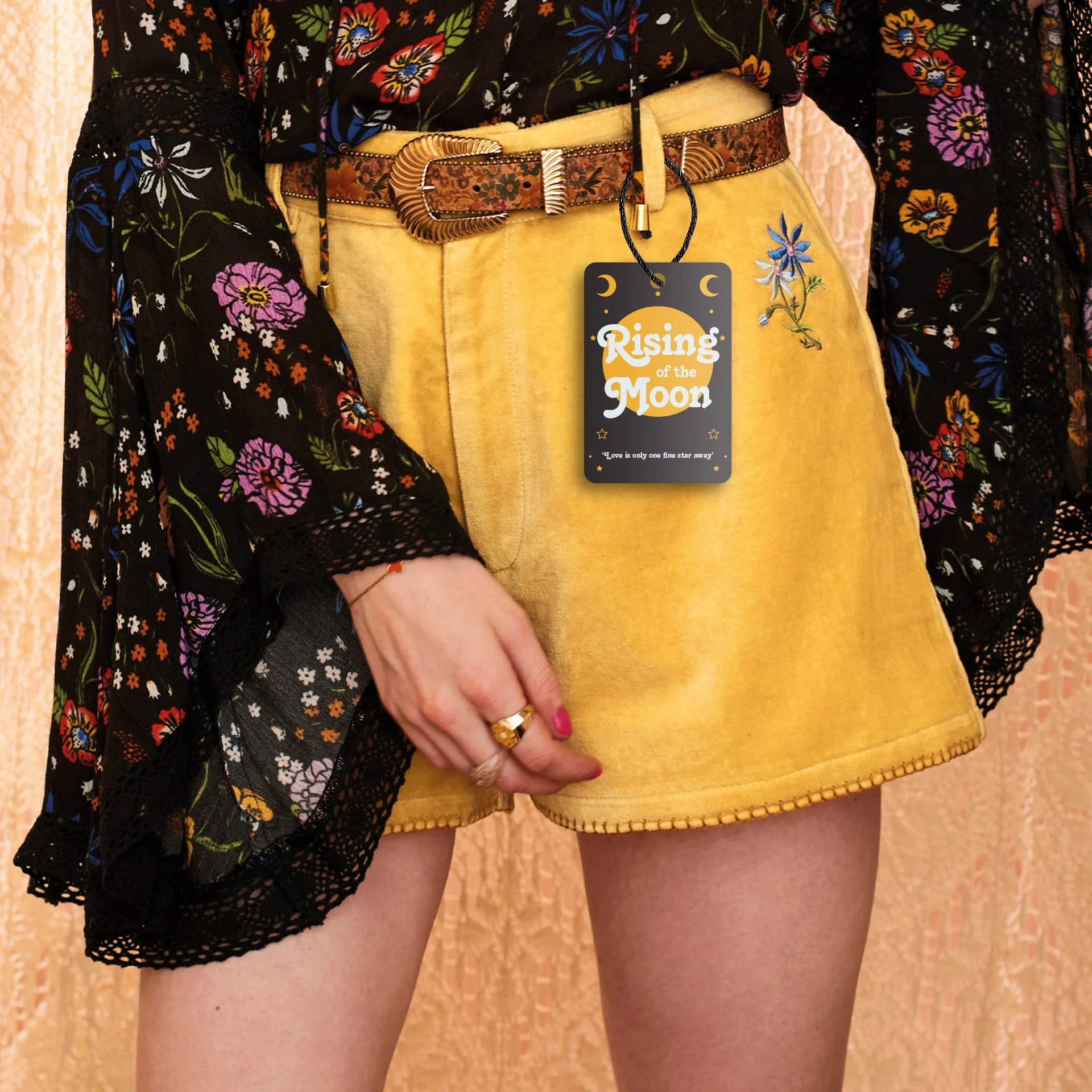
I had chosen a font to represent this collection and created a bespoke lockup, which I added to the front of the swing tag. Also featured is the celestial moon, often associated with Stevie and a nod to one of the prints of the collection. Frequent customers of the brand will often keep both the postcard and swing tag together as mementos of each collection, which are limited.
-
![]()
Lookbook
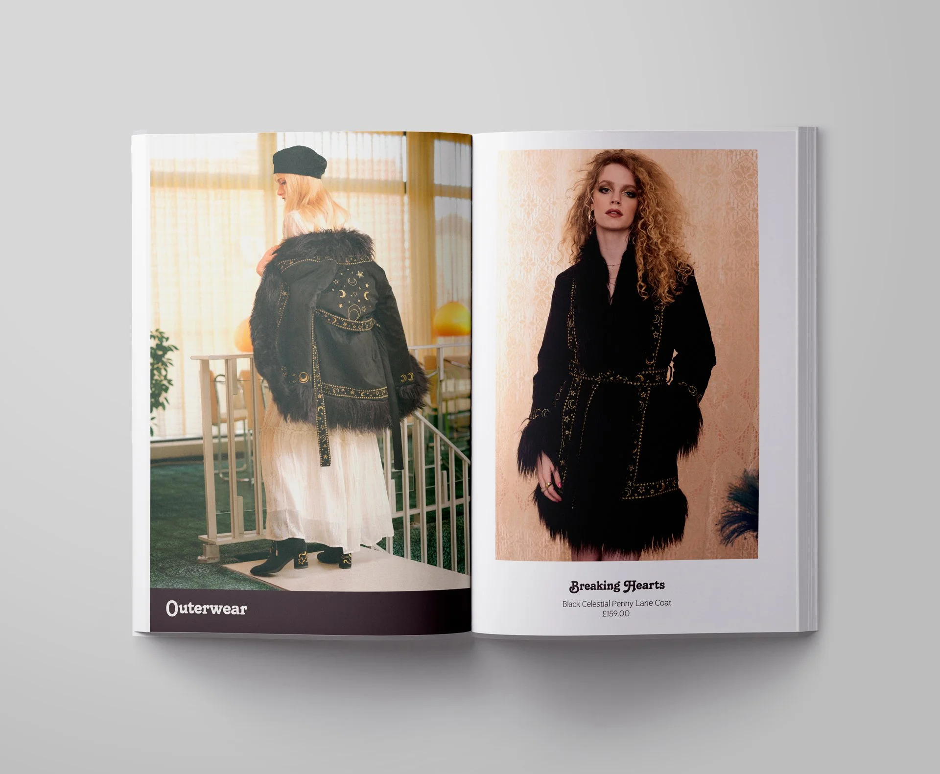
During the sale of this collection, we had a physical pop up store, so people could come and see the products in person rather than solely online. For customers waiting to use the changing room we had a seating area, and for this I designed some print look books for them to look through. Using the collection branding, and a mix of campaign and studio shots, I laid the book out in product categories.
Rainbow Ladyland
-
![]()
Collection Mood Board
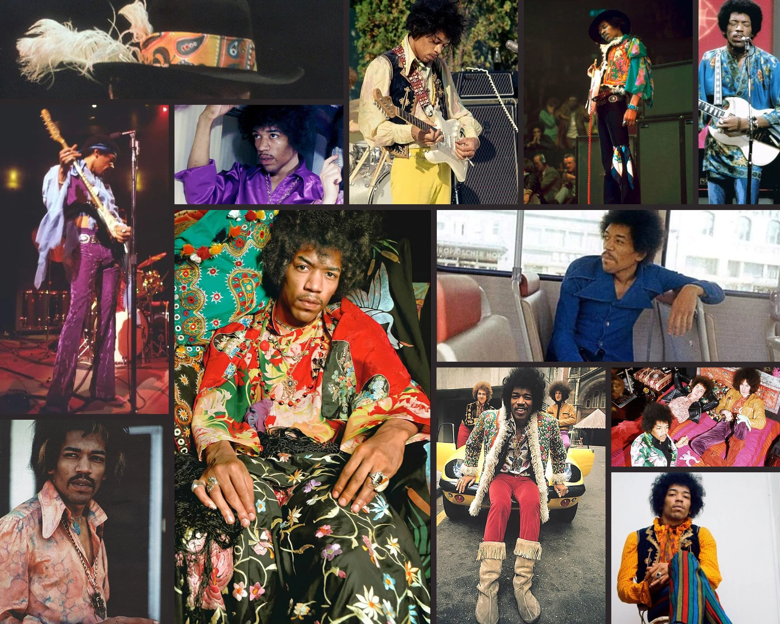
The Hippie Shake’s AW21 collection was Inspired by the king of cool and all time favourite muse Jimi Hendrix, full of psychedelic prints, intricate embroidery, heavenly ruffles and those statement gems destined to become future vintage and passed down through generations.
-
![]()
Campaign Shoot
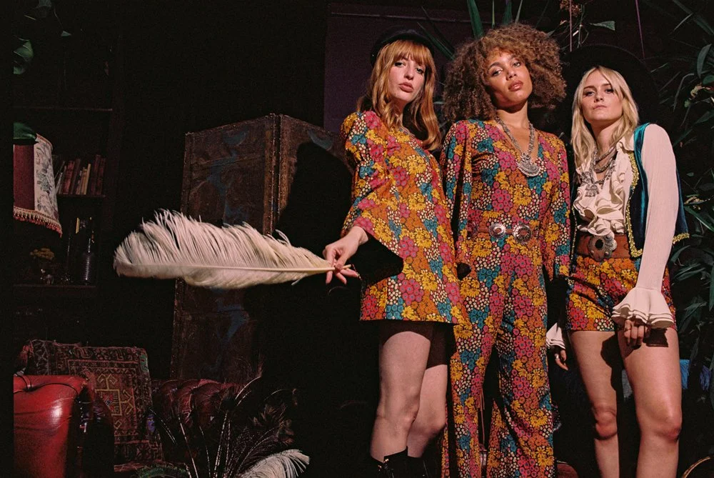
For this campaign, I took influence from many of the iconic images taken of Jimi and his band, and replicated them throughout our imagery. Throughout my print and digital designs I paired these images with motifs from Psychedelic gig posters. To see more images, please see my Art Direction page.
-
![]()
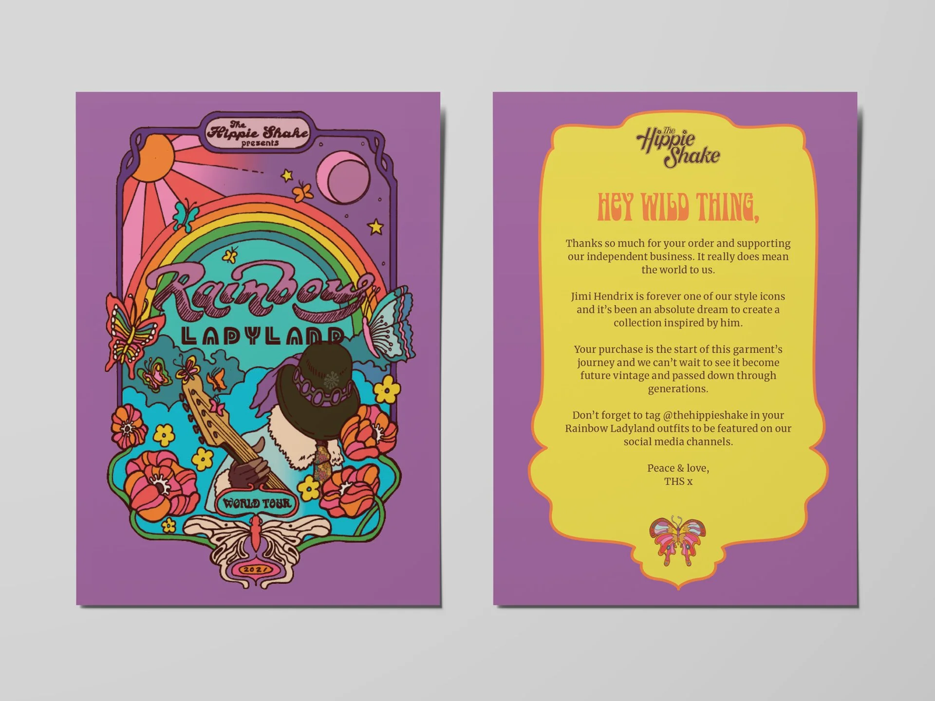
Customer Thank You Card
For each collection, artist and print designer Erin Cadigan designs a custom postcard illustration based on her prints created for the garments. For the back of the postcard, I replicated the psychedelic music poster frame from the illustration and added copy to thank the customer for their purchase. I also used the custom font I had chosen to represent the collection and the butterfly motif that is prominent throughout the collection.
-
![]()
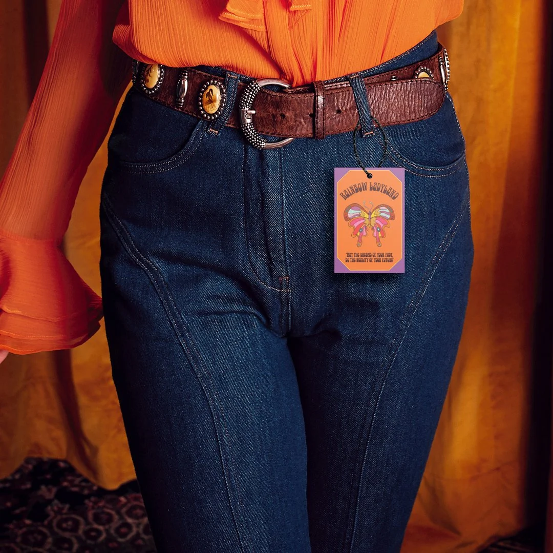
Garment Swing Tag
To sit along side the customer postcard, this swing tag uses a similar colour palette and the butterfly motif, as well as the frame detailing which was prominent in gig posters during Jimi’s reign over the stage. I also added a quote from him underneath. Frequent customers of the brand will often keep both the postcard and swing tag together as mementos of each collection, which are limited.
-
![]()
Collection Launch Event
To celebrate the launch of the Rainbow Ladyland collection, we invited customers to join us for an evening of music and fashion, where bands played and guests had the opportunity to learn more about the collection and see some of the pieces before they purchased online.
-
![]()
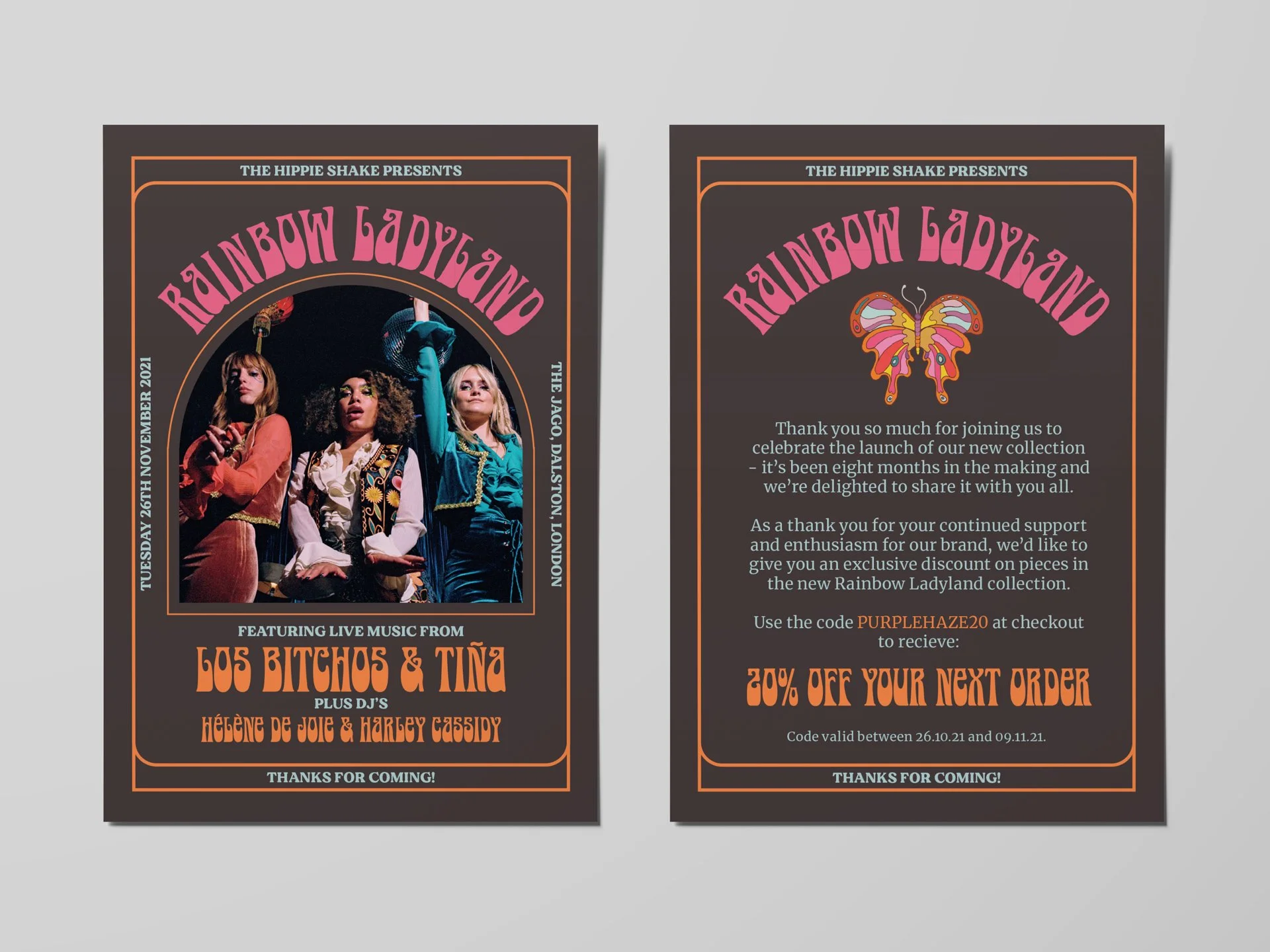
Event Flyer
I created this flyer for guests at the launch party, so they could have a mini poster of the gig to take home showing the lineup, as well as offering them a discount off the new collection with a unique code. As with the other print designs, this design was inspired by psychedelic gig posters of the 1960s and 70s.
-
![]()
Lookbook
As well as having a selection of clothing available at our event for guests to browse, I also designed a print look book to dot around the venue so people could view the collection in full. This was a small print run and the design included the collection branding colour palette and fonts.


